ActionBar column making responsive version look really bad

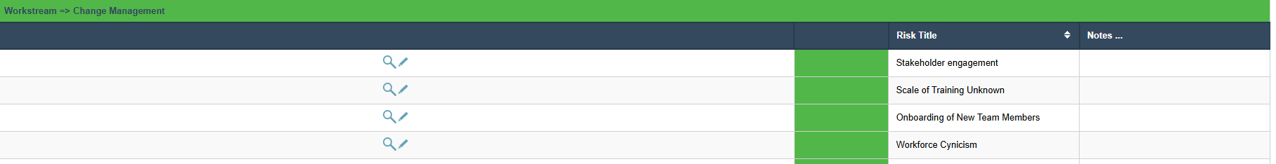
I have a grid with an actionbar that loooks good.

If I remove columns so that less are shown and therefore there is more spce, the actionbar column just extends and looks awful.
image
I’ve tried some css on it, but cant get anything to change the behaviour. the selectors .actionbar and others I picked up from the grid dont impact the grid lines as far as I can see.

There is nothing in the Theme editor either.

I THINK its caused by a combination of ‘provided’ column widths if you provide all widths (Which leaves the actionbar the only one that can be responsive), but this is one column that shouldn’t expand no matter what.
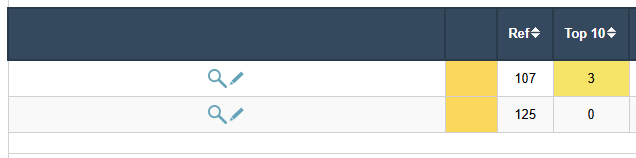
My workaround is to make one or more of the text fields blank width and then this expands rather than the actionbar.

My workaround is only partially successful and would be a nightmare to apply across all grids.

I’ve subsequently tried css with selectors that definitely select the correct cells (I always use a background-color to see what is selected when developing). I’ve tried max-width and other settings but This does not prevent the actionbar from expanding (I think because the cells are inline on a non-fixed table but I’m too rusty with these rules).

I’ve also tried to adjust them with pure javascript triggered by a column in the grid. This runs without error but the damn Actionbar still extends.

This really needs a simple fix at source. I cant think of anybody who wants a static column like this to expand and take real-estate that is better with real data.

To give another example. I used columns in the live app to remove some columns and focus on the columns I wanted.
The Actionbar column (WHICH DOES NOT NEED TO BE RESPONSIVE) took up most of the additional space:

This is just horrible and make us look amateurish.

If anyone can work out how to do this in the NEW actionbar (v9.13) I’d be all ears!

One other point - If I use some other columns as the first column, then the Actionbar behaves as required. Unfortunately, there is no discernable difference between the fields that work and those that don’t

An even more laughable example!

Here is the best hack I can come up with…

  1. In scriptinit target all td elements that contain the Actionbar button container, plus the column header
  2. Add a style to colour the background green to make sure you have selected the correct elements
  3. Remove the background colour and replace it with width: 1% !important

The width = 1% is the key. I tried width = 5px HOURS and HOURS ago but it didn’t work, but I spotted the 1% when looking at a different thing!

You can either echo the style or add it into a style block…

td.sc-col-actionbar-left,
td.scGridFieldOddFont:has(.sc-actionbar-button-container), 
td.scGridFieldEvenFont:has(.sc-actionbar-button-container) 

{ width: 1% !important; } 

I know I could simplify this, but I’m done with faffing on an item that should be standard out of the box.