I am using PHP 8.1.33 and scriptcase version 9.12.023 (2).
This topic is about responsive menu for SmartPhones
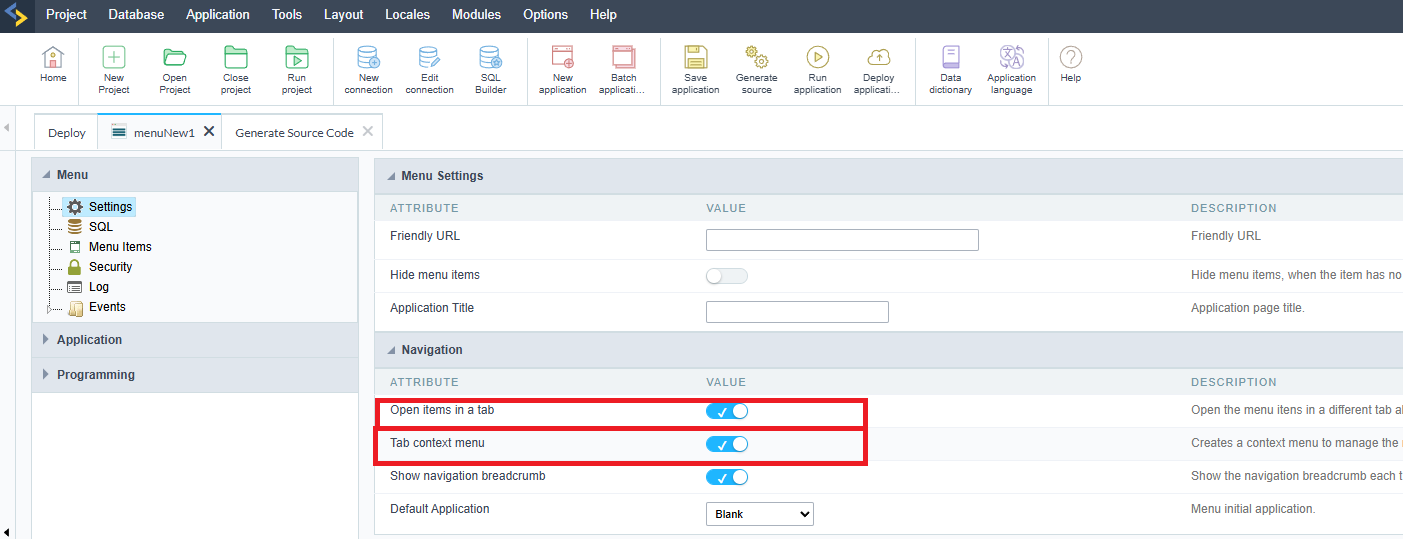
I have noticed that when the Open items in a tab is activated in the Settings of the responsive menu, it doesn’t cooperate as smoothly as when it is deactivated. It’s very uncomfortable for the users and sometimes it bugs out and you can’t find the menu.
In the samples project of ScriptCase, even if you enable this Open items in a tab, you will see what I am trying to say.
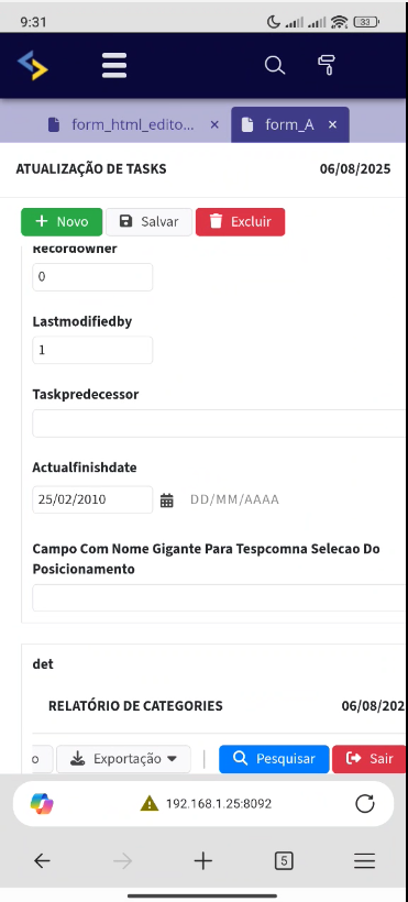
So now that i have activate the Open items in a tab this is the result when i click a link to a menu from a phone:
Where is the MENU ? I have to scroll upwords and many times it doesn’t even work and it bug there and i have to refresh the page…
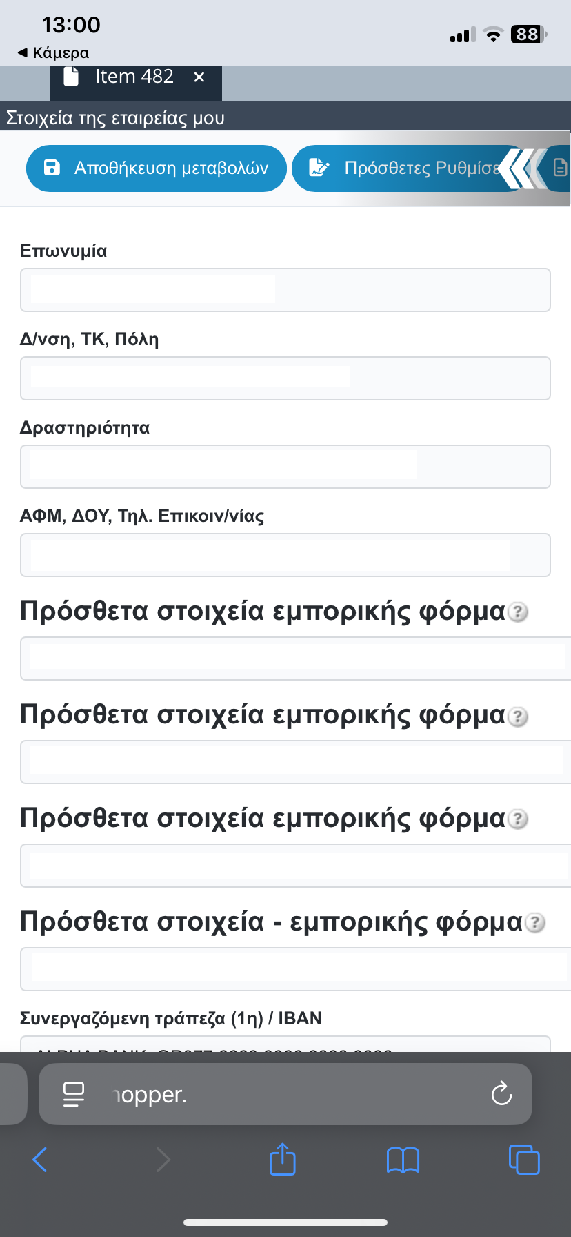
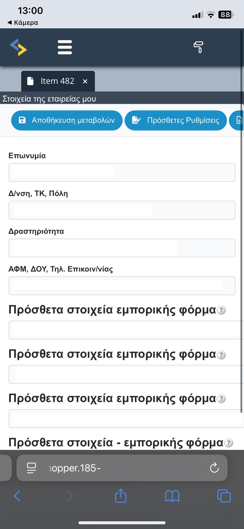
The correct should be like the image below!
One soloution for me to do is that when a user login to my app, i will have a menu app with the Open items in a tab deactivated…
Thoughts ?