I ran into this same problem again on a different project, and decided to make an issue of it with the bug team at SC. Before I start bashing them, let me say that I really like SC and I’m pretty sure most of the developers are way more experienced than I am, something that many posters probably would not agree with in their own case.
However, I discovered that the Document(File Name) method of downloads works OK in a FORM, which is where you’re going to let an admin upload a document and if they wish, later see the same screen and download it again. The form automatically has the file select button and the drag and drop, as well as a link to the file name once it’s been uploaded. That’s really nice.
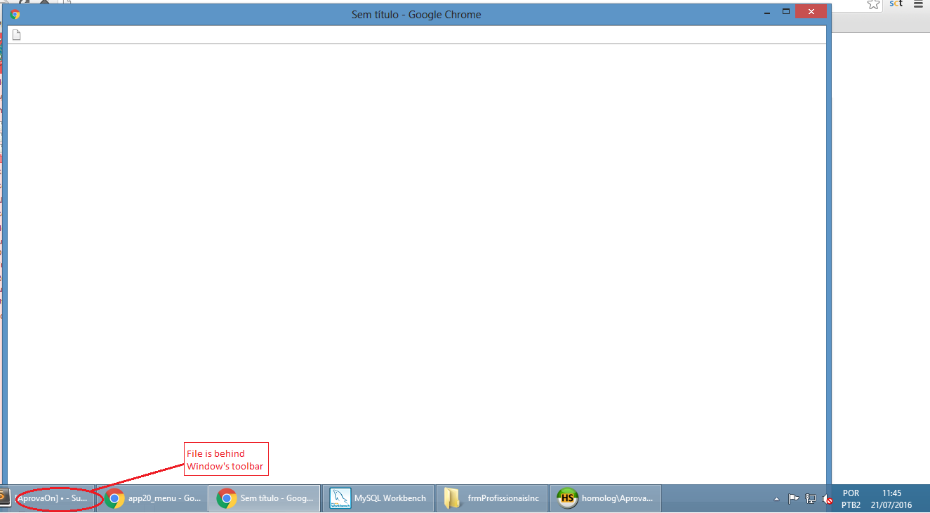
Now put a list of these documents in a GRID, and what happens is that you get a large, blank window when you click on the link and try to download. This happens in Chrome and Edge, and I understand in Apple products as well. It does NOT happen in Firefox, because Firefox pops up a dialog asking you want you want to do, download it, view it, etc.
I reported this to SC recently as a bug. They claim it’s caused by a forced server download and that’s just the way Chrome and Edge behave. They think this is perfectly OK and that it must be opened in a new window because otherwise “the user would miss the page they’re viewing.” Well, yes, except that it does NOT open, it downloads and appears at the bottom of this ridiculous blank page.
When I asked why they can make this work in a FORM but not a GRID, the answer is that a form has an insertion and a grid is just a query. That’s really not correct, either, IMO, since you can open a form, the one you used to upload in the first place, and just click on the link. That link does NOT need to be on a separate page that covers everything up.
So, perhaps others will agree with SC, but as far as I’m concerned this is definitely a bug. Just download the file and forget about a forced server download–no one needs to or expects to view the file on the screen. If they do, they can click on the download and open it.
Just my opinion, but I don’t think SC has the best interest of the user in mind here.
As the old joke goes, I wouldn’t kick her out of bed for eating crackers, but… 


