Field alignment of forms

I am having a terrible time trying to align the fields on my forms.
Even when I put the fields in different blocks, I can’t get them to align.
On the screenshot below I would like to have the No - Yes radio buttons aligned in a standard way, preferably close to the label.
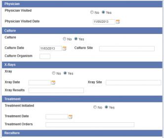
radiopositon.jpg

Am I missing something, I see people have looked at the tread but no suggestions ?

Hi,

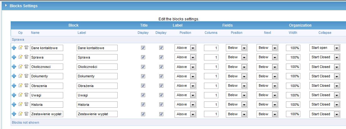
I had the same problem and decided to set each block as 1 column, with fields moved to left. To arrange fields in 2nd column and set all in one line (on the right) propably you need create next Block (Block-right, left side, 50%, 1 column - next beside) + (Block-right, right side, 50%, 1 column - next below) than you will have something like it:

|Block 1 column |
| Block left 50% | Block right 50% |

I not found any other nice solution and decided to divide fields to additional blocks. Please see attachments.

Darek

blocks_1_settings.jpg

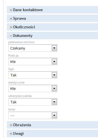
blocks_1.jpg

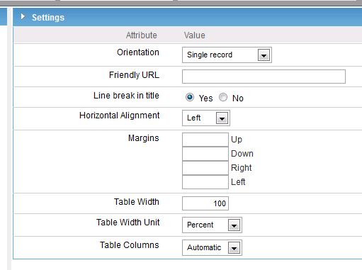
form_settings.jpg

Alignment of fields in forms is pretty much dependent on the length of the first field inside a form or a block, a dummy field set to hidden with an x lenght might help you or an existing field with the right length on the first line of the form or block might help

Hi javierx1,

Workaround with one hidden field with defined lenght is useful. Thanks, will check it.
Anyway, How to move field to next column? S

[QUOTE=daretzki;22228]Hi javierx1,

Workaround with one hidden field with defined lenght is useful. Thanks, will check it.
Anyway, How to move field to next column? S[/QUOTE]

I am not sure I understand your question. Your screens are formatted using blocks. The default block is 1-column all fields, you can change the block for the default to display 2 columns or more. You can create your own blocks of information and display 1 column or more columns.
In the form, go to the led sidebar menu where you see “Layout” click on it then select “Blocks” in next screen you will see options to set the number of columns in a form.
Was that helpful?

this all comes back to my question as to why you couldn’t have a wysiwyg editor to drag and drop fields where ever you wanted.
http://www.scriptcase.net/forum/showthread.php?5847-A-dumb-question

I guess this is one of a few pet peeves about sc. The layout and look is definitely not easy to manipulate. I would like to see more options in the layout of forms and grids.
Pappy

I have my ideas about the wysiwyg part, but I agree on the rest. As soon as you dive into the css part things get difficult as fields influences each other etc. So yes, I would welcome a better way of aligning fields etc. A lot of macro’s influences the look and feel of grid fields, would be great to have them available to formfields too etc.

Will be very helpful if SC will add similar Field positioning like for Blocks. e.g: if I will be able to set fiels as “last in the row” or “next below/beside” will be very nice.

I have troubles too. as soon as you want put fields in line. SC happens to put fields at slightly different vertical alignment for readonly fields, there is no spacing between fields. perhaps you can edit some properties, but common guys, this is basic.

there were discussions about wysiwyg editors. Just a simple one that exposes bootstrap elements and properties would be great step. I think this is the way to go.
right now form building is a nightmare. I already got a client scared away by the standard forms. it just does not look modern and otherwise requires tons of time to edit and make custom templates. I think for SC this is the edge to stand out and not just be acceptable.

I too agree on looking into a WYSIWYG editor. What about a “Preview” feature for the current SC. At least that would help aligning fields to some degree. A fully WYSIWYG may take some time.

I agree. I always ensure that my first field is set with correct length etc. but it really is a bit hit and miss as to where things end up. I would love to see some effort put into allowing us to present ‘Modern’ looking forms. Currently, we are nowhere near :frowning: