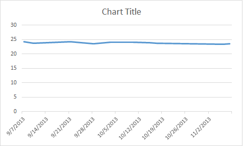
When creating graphs - the system determines the X and Y axis range - and the range is always from 0 to what-ever.
Some charts need to have a smaller X or Y range so the data will stand out better.
The data is: [TABLE=“border: 0, cellpadding: 0, cellspacing: 0, width: 108”]
[TR]
[TD=“class: xl65, width: 72”]24.4[/TD]
[TD=“class: xl66, width: 72”]9/27/2002[/TD]
[/TR]
[TR]
[TD=“class: xl67, width: 72”]24.52[/TD]
[TD=“class: xl68”]9/26/2002[/TD]
[/TR]
[TR]
[TD=“class: xl65, width: 72”]24.77[/TD]
[TD=“class: xl66”]9/10/2002[/TD]
[/TR]
[TR]
[TD=“class: xl67, width: 72”]24.94[/TD]
[TD=“class: xl68”]10/16/2001[/TD]
[/TR]
[TR]
[TD=“class: xl65, width: 72”]25[/TD]
[TD=“class: xl66”]10/2/2001[/TD]
[/TR]
[TR]
[TD=“class: xl67, width: 72”]25.03[/TD]
[TD=“class: xl68”]10/1/2002[/TD]
[/TR]
[TR]
[TD=“class: xl65, width: 72”]25.26[/TD]
[TD=“class: xl66”]9/20/2001[/TD]
[/TR]
[TR]
[TD=“class: xl67, width: 72”]24.7[/TD]
[TD=“class: xl68”]10/12/2000[/TD]
[/TR]
[TR]
[TD=“class: xl65, width: 72”]24.76[/TD]
[TD=“class: xl66”]9/19/2000[/TD]
[/TR]
[TR]
[TD=“class: xl69, width: 72”]24.82[/TD]
[TD=“class: xl68”]9/16/2000[/TD]
[/TR]
[/TABLE]
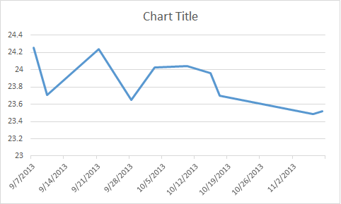
You will notice the RANGE is 24.4 - 25.26 - very narrow (but significant for the data…
SCGraph.png shows what scriptcase will produce…
NiceGraph.pgn would be what should be possible if the X and Y axis RANGE could be controlled.
Thanks!