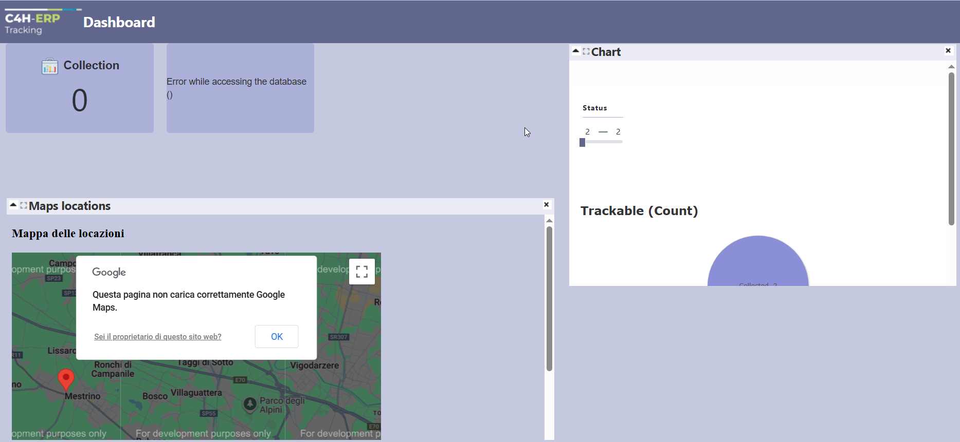
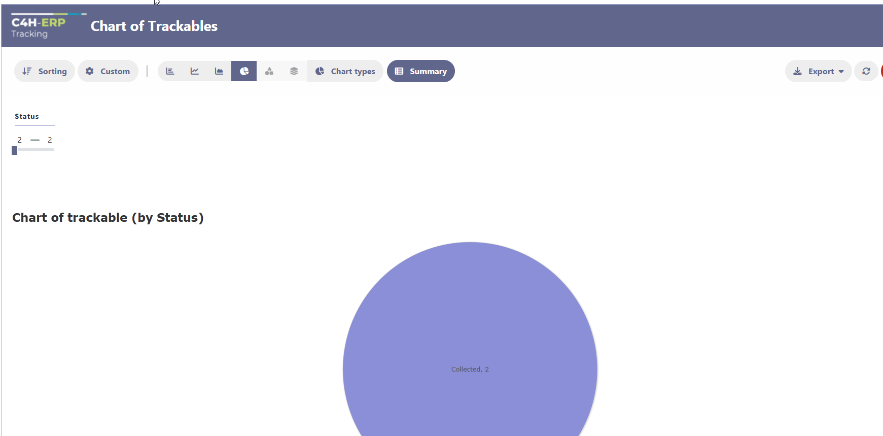
I’m trying to make some test using new dashboard and a part from some issue with connection errors on kpi and then I don’t understand where to set the zoom or something else about the display of a pie chart (as example) . I set the graph Responsive Desktop “on” but when I link it to dashboard I’m not able to fit it into the widget area. I though it makes it automatically. As you can see on attache images the result on dashboard is really very poor. I saw many example of nice dashboard and charts on them but I think they use lot of code to adapt them. How can I obtain something proportioned or still a bigger pie in the middle of widget ?
Thanks