Hi ,
I did a graph with about 1000 points (see image).
Is it possible to show only a part of points or a line only without the circle around each point. It’s quite an ugly graph.
Thanks
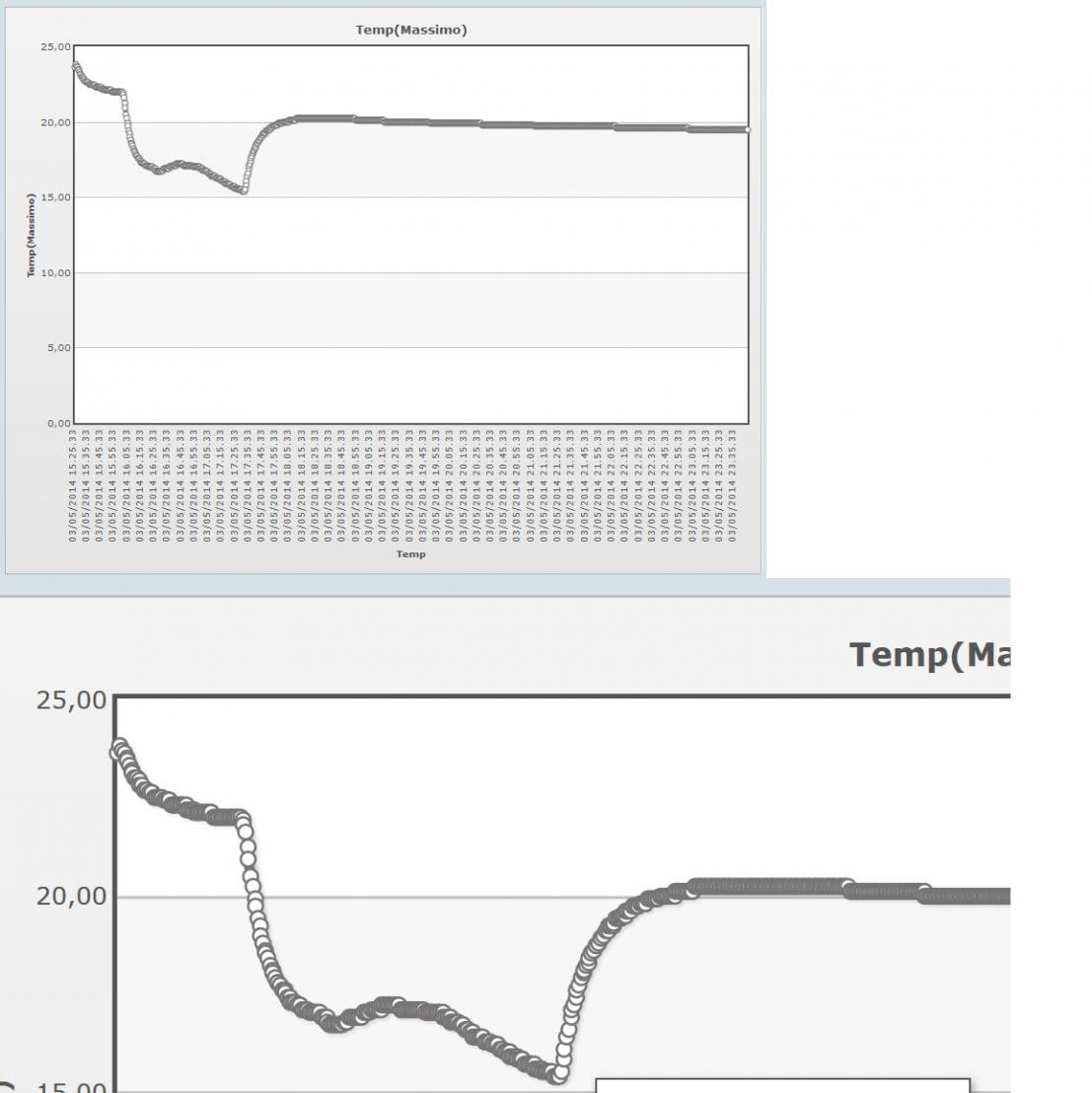

Hi ,
I did a graph with about 1000 points (see image).
Is it possible to show only a part of points or a line only without the circle around each point. It’s quite an ugly graph.
Thanks
perhaps …quality will increase along with quality of SC itself
That’s a bit of a strange reaction. The charts are part of a 3rd party product. Like the use of JQuery, fpdf etc. These products have their flaws too, and it could be a discussion who is responsable for what. If you use a third party product and there’s a bug, who’s in charge? (not intended for a discussion here).
In general using standard products (even open - source) means that you are bound to the possibilities of that product. Of course you can take full control and build everything by yourself and maintain. It would make the creation of tools like SC unpayable…
Arthur, I can accept you being critical, and I have my comments and opinions too. But please stay on topic, nobody is helped with reactions like these. Besides: as you have all kinds of remarks to others filling this forum …