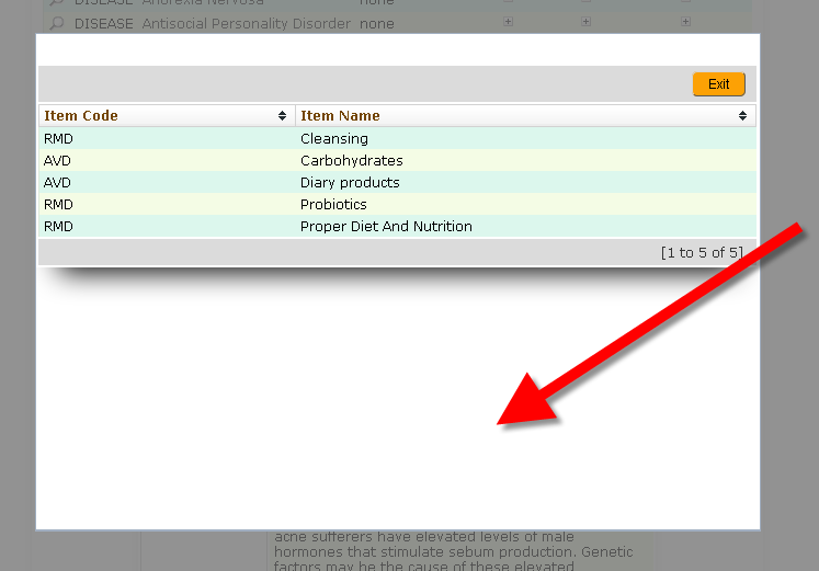
This is popup (modal - child) window opened from the parent browser
Any ideas on how to get rid of excess of ugly white space around the grid ?
Arthur


This is popup (modal - child) window opened from the parent browser
Any ideas on how to get rid of excess of ugly white space around the grid ?
Arthur

Been asked yesterday too. If you have created it with sc_redir using ‘modal’ you need to go into the generated code to see what has been generated as I’m not aware that you can set height and width specs.
Yeah, and that’s the problem. I was hoping there is some way in SC
Art
I agree, this is something for improvement.