Irritating issue with CSS menu icon alignment (for so long)

hi guys, i spent days and weeks now and then, always trying to solve this but never worked fully ok with me 100% as must be

simply, the items are not aligned beside the icons horizontally, and also it is always item touching the icons which looks bad

i tried with css menu that i am using, tried different menus, tried advanced css changing in padding, margins…etc everything you can imagine, but seems the item and the icon are defined as one object in CSS, this is really the outfit of a project which makes it look nice or gives bad impression to end users…

I’m attaching a screenshot for what i mean exactly, i want to know how to control the icon distance from the item text object, like 3 or 4px will be nice, and to make them align in middle virtically regardless to font size will solve the issue… or perhaps if we can align it vertically, then an extra space before the item text will do! but there is not such option as valign in advanced css of the theme and don’t know how to do that in other way… moreover, note that in preview of the application in development (before the run button) looks good, but once you run it it will show bad as you can see in the screenshot… i know there are “dirty” workarounds like playing adding a white or transparent background with extra pixels to the icons, but it is not practice, please can I add custom css in the menu application events and apply only for text or only for icon?

your help input or any idea is highly appreciated
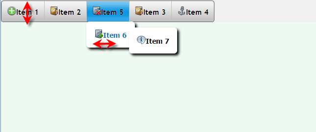
cssMenu.png

Mike,

To solve the menu issues, from the onLoad event:
[SIZE=2]
echo "
[INDENT]<style>[/INDENT]
[INDENT][INDENT].topmenu a {[/INDENT][/INDENT]
[INDENT][INDENT][INDENT]vertical-align: middle;[/INDENT][/INDENT][/INDENT]
[INDENT][INDENT]}[/INDENT][/INDENT]
[INDENT][INDENT].topmenu a img {[/INDENT][/INDENT]
[INDENT][INDENT][INDENT]vertical-align: middle;[/INDENT][/INDENT][/INDENT]
[INDENT][INDENT][INDENT]margin-right: 10px;[/INDENT][/INDENT][/INDENT]
[INDENT][INDENT]}[/INDENT][/INDENT]
[INDENT][INDENT].topmenu ul li a {[/INDENT][/INDENT]
[INDENT][INDENT][INDENT]vertical-align: middle;[/INDENT][/INDENT][/INDENT]
[INDENT][INDENT]}[/INDENT][/INDENT]
[INDENT][INDENT].topmenu ul li a img {[/INDENT][/INDENT]
[INDENT][INDENT][INDENT]vertical-align: middle;[/INDENT][/INDENT][/INDENT]
[INDENT][INDENT][INDENT]margin-right: 10px;[/INDENT][/INDENT][/INDENT]
[INDENT][INDENT]}[/INDENT][/INDENT]
[INDENT]</style>[/INDENT]
";
[/SIZE]

This should fix everything up.

Dave

[QUOTE=daveprue;29153]Mike,

To solve the icon and text separation, from the onLoad event:

echo “<style>.topmenu ul li a img {margin-right: 10px;}</style>”;

Fixing the vertical-align of the icon and text can be done much the same way.

Dave[/QUOTE]

Thanks a million Dave, you are my “new hero” of “the struggle times” :smiley:

Worked perfectly, hmmm, even I tried many thing in CSS as I consider myself good at it, but didn’t really reach to 100% as reasonable solution as this one :smiley:

echo "<style>.topmenu ul li a img {margin-right: 5px;}</style>";
echo "<style>.topmenu ul li a img {vertical-align: middle;}</style>";

that is for the image icon, i hope if removed the “img” then it will affect the text (lool)

Appreciated a lot!

Cheers

[QUOTE=MikeDE;29156]Thanks a million Dave, you are my “new hero” of “the struggle times” :smiley:

Worked perfectly, hmmm, even I tried many thing in CSS as I consider myself good at it, but didn’t really reach to 100% as reasonable solution as this one :smiley:

echo "<style>.topmenu ul li a img {margin-right: 5px;}</style>";
echo "<style>.topmenu ul li a img {vertical-align: middle;}</style>";

that is for the image icon, i hope if removed the “img” then it will affect the text (lool)

Appreciated a lot!

Cheers[/QUOTE]

Yes, Mike

.topmenu a img - gives you the “menu bar” image
.topmenu a - gives you the “menu bar” text
.topmenu ul li a img - gives you the “menu items” image
.topmenu ul li a - gives you the “menu items” text

Nested submenus are left as an exercise for the reader :slight_smile:

Dave

[QUOTE=daveprue;29157]Yes, Mike

.topmenu a img - gives you the “menu bar” image
.topmenu a - gives you the “menu bar” text
.topmenu ul li a img - gives you the “menu items” image
.topmenu ul li a - gives you the “menu items” text

Nested submenus are left as an exercise for the reader :slight_smile:

Dave[/QUOTE]

ok well, the sub-menu were ok using that, but the main menu still messed up a bit! i feel it like my exercise now loool (removed the cache, but i think i have extra in pixeles the text making it above the required line, will try to arrange :slight_smile:

Dude, I don’t think you ever sleep…

not really, i sleep at night loool

ok dave, i think i am stuck again, i need to to push down my main menu (not the sub-menu) just 1 or 2 pixels to down ▼

tried padding and margin in each css line {a} but didn’t effect, i know it is petty, just trying to make it look awesome :smiley:

The whole menu bar you want to increase the margin at the top?

<style>
#idDivMenu {margin-top: 2px};
</style>

If that is not what you are looking for, maybe you are saying that the vertical-align of the icon is still not perfectly centered with the vertical-align of the text. That is because text is vertical-aligned differently, because browsers leave a couple of pixels for descenders (the tails of the y and g). Not much that you can do about that, other than move the icon up a couple pixels by changing the size of the icon in photoshop or an icon editor.

Dave

[QUOTE=daveprue;29164]The whole menu bar you want to increase the margin at the top?

<style>
#idDivMenu {margin-top: 2px};
</style>[/QUOTE]

no just the first level item text, although it is aligned ok with the image (with margin-right and valign middle) but stil the text a bit at top, needs to go down 1 or 2 px

Yep, you are into the very grey area of browser logic now. The browser doing the vertical-align of the icon is straightforward - field is 20 pixels high, icon is 16 pixels high, it pads top and bottom with 2 each. Text is not so straightforward, because of descenders. the height of the text includes a few normally blank pixels underneath to support underline and/or letters y, g and other descenders.

You can bring the icon into photoshop, add 4 rows of blank pixels to the bottom and re-upload it.

Be aware, you are treading in territory though that is VERY liable to change from one browser to another. Look at the screen in a few browsers before you go to all the effort for something so insignificant.

Dave

Thanks Dave, you are right, I will do that and keep it as is, not to “fight” with other browsers then hit my head with a wall :smiley:

Cheers

hi again dave,

do you have workaround or solution for a container that i want to center it in the page, i tried margin and padding things from advanced css editor but you know, nothing works as works by using the code of the onLoad that you was effective and target to the point… it is always either go right or left around 10px

also the menu, couldn’t make it work on mobile! after applying that code, it is always centered! on mobile center with 7 items makes it look 3 x 1 x 3 like 3 lines above each other , 3 in the first one, 1 in the second one, and 3 in the last line! really ugly greeee

i would appreciate you if you give us overview about how to catch the div and how to fix it perhaps some basic css but how to apply to sc in onLoad!? i guess everybody will be happy, css in SC and their editor/advanced editor is really complicated and many things are not covered or does not work as supposed to…

thanks in advanced dude

dave, sorry again, after reading my previous feedback, wanna highlight also this point not to forget
what i noticed, our changed values to maintain the menu items alignments became thick blue lines in the stupid Internet Explorer (only) while working fine in FF and choroe, should we add some boarder=0?