Label fields are too high on forms

If I set a field to be “Label” or “Radio” on a form, then the field appears a lot higher up than its matching descriptive label:
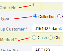
image

This looks horrible on the form.

I cannot find a separate padding value in the themes, so at the moment I have to correct the CSS padding on each individual label, which is not great. Does anyone have a better solution? It’s been like this since we started working with SC about 5 years ago!

What does ythe label. setting do for you here?

Hi @lewis200. Actually, I realise the top one in my screenshot is not set to label, it’s the primary key so SC is automatically showing it as a label. But it’s the same symptom and you can also see it on the radio buttons. Do you all get the same thing when you use those fields? Doesn’t it niggle everyone to see those misaligned labels? I wouldn’t like to show it to a customer.

It’s one of the first things I am told when I do a demo.
It looks like sloppy development

1 Like