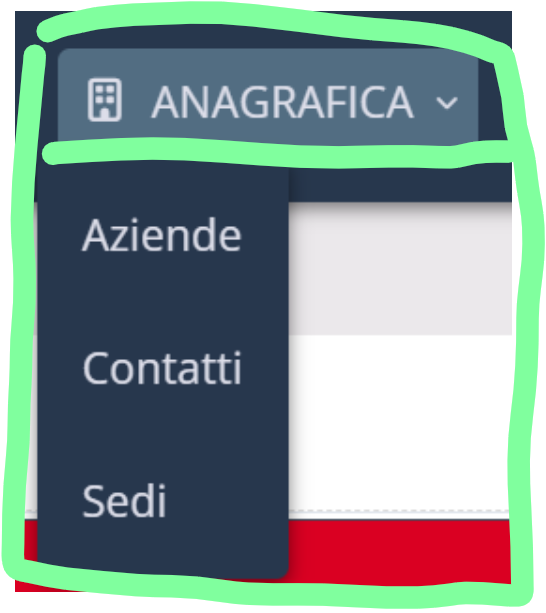
Estoy experimentando una situación después de realizar la actualización de ayer, el espacio de los subitems en el menú se han hecho mucho más angosto lo que produce que los labels se vean con los textos cortados.
Alguien con la misma situación

Estoy experimentando una situación después de realizar la actualización de ayer, el espacio de los subitems en el menú se han hecho mucho más angosto lo que produce que los labels se vean con los textos cortados.
Alguien con la misma situación
Can you please share with us images of the problem you are facing?
We await your return so we can continue.
Best regards!
Usually the menu text adjusts to the width of the container but for some reason now the submenu container is narrower and causes what the image shows
Thank you for getting back to us with these details.
This issue has already been reported so that the responsible team can work on releasing the fix.
As soon as the fix is released, we will provide feedback through this thread.
Best regards!
@Danilo_Lima i appreciate NetMake’s effort to fix issues like this as quickly as possible, but the real question is why they release SC updates with issues that are so easily noticeable.
Especially with the responsive menu, it seems that before releasing a new change no one is testing it with just a few different configurations (menu titles of different lengths, ecc.) that would easily catch most of the latest issues
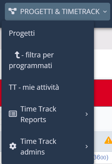
speaking of drop downs width, there’s an issue that has always been present:
if a main menu has a title that is larger than any of its sub items, the result is shown in the image below.
this happens because the dropdown width is automatically sized to the width of the larger sub item text, completely ignoring the width of the main menu item.
@NetMake: please change it so that the width of the dropdown is never smaller than the width of the main menu item
9.12.006 is out but this issue is still present.
i have to deploy asap a change to the menu app, but if I do users will see this mess;
In menu app, onApplicationInit event
?>
.submenu .wrapper .label, #list_megamenu .wrapper .label { max-width: 100% !important; } <?