Please Fix IDE

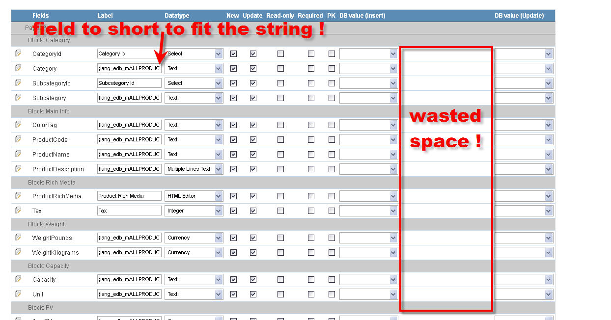
Please fix the problem with the fields being to short. This happens everywhere and I really do not understand the intention of making fields so short while there is so much space wasted on the screen.
This same problem applies to DICTIONARY, FORMS, LANGUAGE editor, and several other places. This is a simple and easy fix but will help and save lots of time so one does not have to sroll hundreds ot time in order to see the whole string. This has been reported number of times in the past starting with SC6 and so far it is still ignored.

[SIZE=4]DEAR NETMAKE please fix this design issue ![/SIZE]

Arthur

WastedSpace_05.jpg

The configurability of SC Grids is not what it should be, but I’ve seen one that was worse.

Yes, this is an obvious deficiency.

But, I don’t like to complain w/o offering an alternative.

The SC devs would benefit from monitoring the Dojo toolkit.

Check out the Dojo project’s DataGrid object.

Then there’s Dojo’s EnhancedDataGrid that’s more consistent with Dojo’s data models, and adds support for plugin filters.

Try out Dojo’s EnhancedDataGrid example.

The column widths can be specified at design-time, or set to Auto-Width. The user can even resize columns at run-time.

I’ve had some success implementing a blend of ScriptCase and Dojo objects in the same project. It’s a 7/10 difficulty though.

SC Devs: at least look at the grid demo. There is functionality there that I wish ScriptCase’s Grid apps had now.

Dojo isn’t perfect, but it is OpenSource…