another bad design example - please fix it !

another bad design example - please fix it !
Hello aka,
this is due to the reason you have only a single language, if you have more, the same blank is being filled.
Thank you!
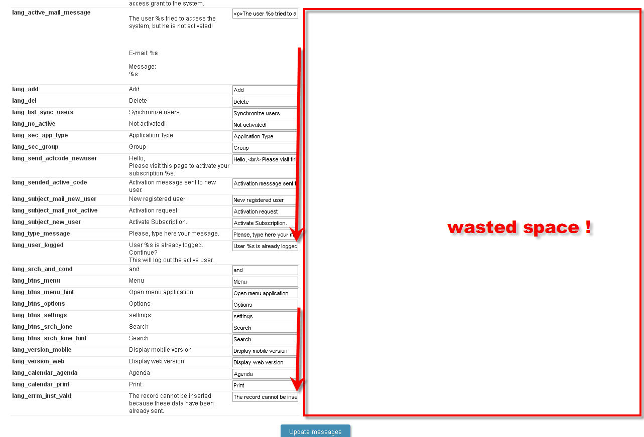
obviously you did not get my point!
Can you see the strings truncated ? I hope you can
while there is plenty of space left. why not to make those fields longer so user dos not have to scroll every time he needs to see/read full string ??? it is just a common sense - right ?
Arthur
aka
The “full” string is to the left of the text box, i.e. it updates once you save whatever you typed in the text box. So you can see the full text, just not as you type! However, yes, it would be nice to see more than what is shown in text box.
SC I also take your point if multi language, but maybe a tabbing or hiding / collapsing column mechanism to allow user to choose what is visible, and resizing the screen usage accordingly?