PLEASE FIX TERRIBLE DESIGN ISSUES IN IDE

WASTED SPACE SAGA CONTINUES…

Whoever is designing SC IDE needs to go back to school ! Where is a common sense ?
why do I have to click and scroll every time I need to read something from the field while there is plenty of room to enlarge field sizes ?
I have posted at least half a dozen messages about that. So far few have been fixed but why not to go through entire interface and just make those small adjustments. It will not take much time but will SAVE US LOTS OF CLICKING AND SCROLLING ! PLEASE GUYS THINK LIKE A USERS/DEVELOPERS NOT LIKE A SELLERS - this attitude is so wrong

[ATTACH=CONFIG]n68118[/ATTACH]

IDE_WastedSpace_005.jpg

Sir, This can’t be considered a bug, because it doesn’t interfere with your development. I’m going to move this post to the suggestion category. Perhaps @Cavadinha can help you with that suggestion.

Carlos - You keep concentrating on the category instead taking care of the fix. Whatever it is called it has to be taken care of - do you get this ?
You guys not fixing bugs, you are known from that and 99% users on this forum complain about those issues since I started using SC5.
BUGS and SUPPORT - two bigest nightmares when dealing with Scriptcase.

Now tell me how much time would it take to fix this problem - described in my post ? 10min or less ?
DO YOU UNDERSTAND MY POINT ?

Well, just for clarification, first, its important to take care on category, because if its not a bug, is not a bug, and…you are not the 99% of this forum.

AKA I understand your point, but since the issue that your having is not a bug. It can’t be in the bugs category, if you’d like you can send a suggestion to our team at suggestion@scriptcase.net.

Thank you for your suggestion.

The input need to have a width value, a developer can write a 15 character long variable or a 30 character long.
At the time anything bigger then 150 pixels would be bad. No promises but I’ll check if its possible to increase 50 pixels in those kind of fields, it will still truncate bigger variables, but will be bigger.

Bottom line is that there is no good size here, either it’ll look truncated or can have a small variable in a huge field (wasted space as you say yourself).
About the “wasted space” thing, that space is not wasted. If you select DB value in the first two options you know that space isn’t wasted.
In fact, I believe that’s why your screenshot is cropped in the first place.

Example below:

[ATTACH=CONFIG]n68339[/ATTACH]

Untitled.jpg

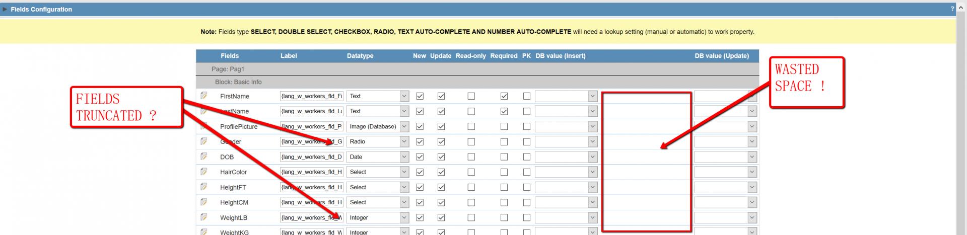
By saying “wasted space” I mean another area of the screen where there is NOTHING (another words it is blank), while the space where I need to see data/text/ or whatever is truncated.
I would setup your monitor to 1280 x 1024 pixels resolution and see what is available in sense of EMPTY SPACE and WHERE the strings might be truncated. We do not live in DOS era when filenames were limited to 8 character so most people use meaningful names for their tables, variables etc. If enlarging field is not possible (because of the hidden string, checkbox etc next to it) another simple solution is to create a BLOON? TIP (which will show the full string). This is common in Windows when you pint to the folder - it shows folder info etc.
Even on the presented screenshot the checkboxes are far apart and could be closer.

Another issue is a font size. PLEASE make the fonts in SC the same size. Remember that some people (like me) use 4K monitors and many fonts become almost unreadable. If you inherit SC font sizes from system (OS) then it all should be fine. In recent version you enlarged the App icons (on the application bar - top) and this causes less of them to be visible. If you compare the fonts to the fonts on the screen when you make a LINK to another App there is about 200-300% difference in size - WHY ? To make me reach for magnigying glass ?
Those are such simple design elements that should not even be discussed here - just a common sense and some experience. If there is no experience one can simply look at other tools and see how they are designed. I do not like Microsoft products but in many cases their interface if really well designed and this is where one should learn.

SC itself makes it complicated because when you create new Apps it assigns long names to the Apps. I renamed all Apps to shorten their names but in many cases it is still to long to see.
Instead of grid_App1 you could easily use gd_App1, instead of Form_App2 you vould use fm_App2 etc. etc.

If you would make the left panel of SC collapsable (or better yet resizable) , then if would also allow much more room for other info


since you talk about those things I want to bring something else to your attention.

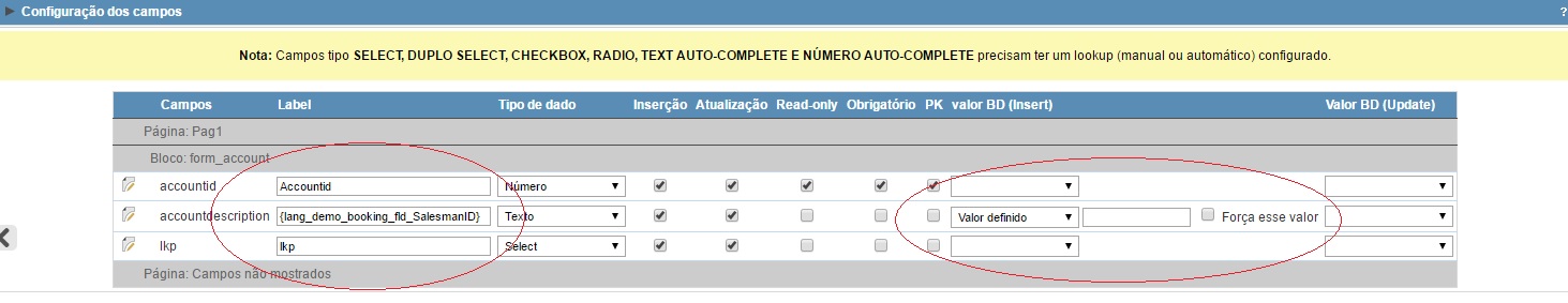
Whenever I tried to use in EDIT FIELDS (form) --> Force this value - IT DOES NOT WORK AT ALL
am I doing something wrong or what is this setting for ?

Cavadinha - once again I disagree with this policy and will not accept it.
You team is know from posting this statement “the bug (or issue) was reported to the development team”. AFTER THAT NOTHING HAPPENS AND I HAVE A LIST OF BUGS NOT FIXED FOR @ (TWO) YEARS. Yess you read it right! TWO YEARS ! so what are you talking about ?

In my entire 35+ yrs IT career I have never seen a company who marks the bugs as resolved the moment they plan to fix it but rather the moment the bugs have been fixed - period!

UNTIL IT IS FIXED YOU SHOULD NOT MARK ANY POSTS WITH BUGS OR ISSUES AS “RESOLVED”
The explanation is simple. I do not have time to track your bug fixes and go and marked them as fixed. This is your job to do it. I’m not a beta tester. Once the update with the fixed is released to the pbulic and can be confirmed as repaired you should then go and change the status to RESOLVED. Doing it your way makes false impression that you gouys react super fast and do the bug fixes almost on the fly why everybody knows that this is a major problem with NetMake.

Replying some arguments

— first comment —
Even on the presented screenshot the checkboxes are far apart and could be closer

Remember that some people (like me) use 4K monitors

  • Won’t discuss this with you (AGAIN). We work with the minimum resolution of 1366 x 768 pixels. And we support more then 70% of the resolutions used in the entire world. It is impossible to achieve 100% in a proper way, but we’ll work to raise our standards to reach from 768p to 2160p.

If you would make the left panel of SC collapsible

  • This is actually done in our development version and will be released to the public soon :smiley:

We know that our interface needs to be improved, and we are working on it.
The next major version will probably have a renewed IDE.
We will try to improve 2 major points which are responsivity and usability.

— second comment —
Once again I disagree with this policy and will not accept it.

  • Which policy are you talking about mate? I am just stating facts and arguing that you don’t see the whole picture.
    Just your side. Things get pretty tighten in smaller resolutions. If don’t want to accept this fact, well I just don’t care.

I HAVE A LIST OF BUGS NOT FIXED FOR @ (TWO) YEARS.

  • Most of your “bugs” aren’t bugs. Most of them are improvements YOU would like to see asap. Improvements are improvements and each one of them would be better for the community in general. I agree to that.
    However, when things like this topic, that don’t get in the way of the tool’s functionality are positioned in the bottom of our priorities.
  • Rest of the second comment: You just used the space to talk about another thread and I won’t discuss that.
    I’ll say only this: If I marked it as resolved, it is resolved.
    That topic that I closed as resolved, I personally checked and fixed it. And I told you to wait the next release for the fix.
    It is not my job to release the tool’s updates to the users.

Have a nice day.

I agree with the most of your comment here. Yes it is not easy to maintain all resolutions but we need to include 4K monitors - that’s the reality. I hope you do not ask developers here to go to their customers and ask them to downgrade their monitors because the software cannot handle it. Fortunately web browsers can take over this issue temporarily to enlarge things (but not to realign them) and that’s where the problems remain.

I"m glad to see some IDE improvements that are coming, so I will stop comment here until I see them.

For the bugs - you statement is not true. I have a list of at least 10+ bugs that have not been fixed until now so this is still where we users suffer the most. Run a simple survey on this forum and ask people if they are happy with your bug fixes and management. DO THIS!
If you get more than 50% positive responses I will never again complain about NetMake not fixing bugs and will admit - that something is wrong with me. Otherwise change your bug fixing attitude and implement some public bug tracking software (there are tons of free tools) so you can prove us you do fix bugs in a timely manner.

For the part when you say “I fixed it” weather you did it or not marking it as RESOLVED until the update is published is terribly bad idea. I have never seen any company doing something like that!

BTW. If you or anybody with the ADMIN permissions plans to close the THREAD, please post “CLOSED” keyword in the header so I do not waste time typing just to find out later that I cannot save. It is terribly iritating