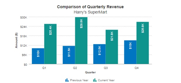
Is it possible to plot multiple values on a scriptcase chart say with actual monthly sales and target sales value?
Maybe the target sales could be plotted as a line chart and the actual sales could be plotted as a column chart?

Is it possible to plot multiple values on a scriptcase chart say with actual monthly sales and target sales value?
Maybe the target sales could be plotted as a line chart and the actual sales could be plotted as a column chart?
I’ve been trying this too with not much luck. If it isn’t possible it at least is a feature request. Bartho???
Yes this is possible if you convert your column data into row data, then you can do comparison chart
Hi,
how can we convert our column data into row data ?? I can’t find . Finally I wanna reach a chart like Bar HTML 5 Chart. I can do that like this way ,right?
plus one for this, i am looking for this since long time now, please jkazondovi, if you can, highlight it for us… thankfully
Hi hakan, itsme3,
This is how i converted column data to row data to enable me to do comparisons in a scriptcase chart.
Suppose this is the existing data in a table (sales_performance)
month montlhy_target monthly_sales
jan 100 90
feb 200 150
mar 300 230
apr 400 330
etc.
I would convert this as follows:
select month, “monthly_target” as chart_field, monthly_target as chart_value from sales_performance
union
select month, “monthly_sales” as as chart_field, monthly_sales as chart_value from sales_performance
The convert data (from columns to rows) to scriptcase will look like this:
month chart_field chart_value
jan monthly_target 100
jan monthly_sales 90
feb monthly_target 200
feb monthly_sales 150
mar monthly_target 300
mar monthly_sales 230
apr monthly_target 400
apr monthly_sales 330
With scriptcase then you will be able to compare chart_field
Hope this helps.
Regrads,
Jephta
Will try this and let you know, seems interesting
Cheers 
Hi
may I ask you to give an explanation and code example on this, I can’t make it:
[QUOTE=jkazondovi;24641]
With scriptcase then you will be able to compare chart_field
Jephta[/QUOTE]
couldn’t make it work either
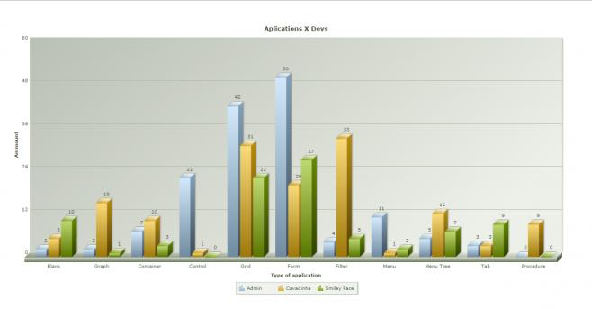
Are you guys struggling for multi series chart?
like the one below:
Yes we are, Cavadinha, if you can arrange for tutorial or webnar or a video would be great.
The chart app is new so we will continue to improve it in the future releases.
So, you need to make a blank app and use all its power. I will post a static example, it should be enough.
Switch -> INSTALL_PATH to your folder.
For more custom charts read FusionCharts documentation.
We have the right to use their lib so enjoy this powerfull add of V8.
The expected result should be this:
Code below:
?>
<script language="javascript" type="text/javascript" src="/INSTALL_PATH/prod/third/jquery/js/jquery.js"></script>
<script language="javascript" type="text/javascript" src="/INSTALL_PATH/prod/third/fusioncharts/FusionCharts/FusionCharts.js"></script>

<div id="chart-container" style="margin-top:35px;">FusionCharts will render here</div>
<script>
    var chartReport;

    $(function() {
            generateGraphAppDev();
    });

    function generateGraphAppDev()
    {
            chartReport = new FusionCharts({
                type: 'mscolumn3d',
                renderAt: 'chart-container',
                width: '1200',
                height: '600',
                dataFormat: 'json',
                dataSource: {
                "chart": {
                "caption": "Aplications X Devs",
                "xAxisName": "Type of application",
                "yAxisName": "Ammount",
                "theme": "fint"
            },
            "categories":
                [
					{
						"category":
							[
								{"label": "Blank"},{"label": "Graph"},{"label": "Container"},{"label": "Control"},
								{"label": "Grid"},{"label": "Form"},{"label": "Filter"},{"label": "Menu"},
								{"label": "Menu Tree"},{"label": "Tab"},{"label": "Procedure"}
							]
					}
				],
                "dataset":
					[
						{
							"seriesname":"Admin","data":
							[
								{"value": "2"},{"value": "2"},{"value": "7"},{"value": "22"},{"value": "42"},{"value": "50"},
								{"value": "4"},{"value": "11"},{"value": "5"},{"value": "3"},{"value": "0"}
							]
						},{
							"seriesname":"Cavadinha","data":
							[
								{"value": "5"},{"value": "15"},{"value": "10"},{"value": "1"},{"value": "31"},{"value": "20"},
								{"value": "33"},{"value": "1"},{"value": "12"},{"value": "3"},{"value": "9"}
							]
						},{
							"seriesname":"Smiley Face","data":
							[
								{"value": "10"},{"value": "1"},{"value": "3"},{"value": "0"},{"value": "22"},{"value": "27"},
								{"value": "5"},{"value": "2"},{"value": "7"},{"value": "9"},{"value": "0"}
							]
						}
            		]
        		}
    		});

            chartReport.render();

    }
</script>

<?php
Interesting to try, will give it a shot.
Thanks Cavadinha.
Yes we are. I would be helped much if I know how to put multiple series in charts. Not only this one, but also a line chart etc. Would be great if you have a step by step explanation. The javascript means that you have to generate a lot of echo’s to get that done, as you can generate the charts from grids. So it would be great if we could generate multiple series from a series of grids? I would like to avoid javascript.
We are javascript, you will be assimilated…resistance is futile … javascript is the future*…

Didn’t know that the Borg assimilated Spain already … 
Inside a blank app you can just copy + paste the exact code I posted.
When you close the php tag
?>
You can work inside the blank using html and javascript without echo’s.
Just don’t forget to open the tag when you finish with your front-end code.
<?php
Just like the example.
Albert, I spent good time trying this with line charts without results in SC7, then the project was canceled but I put it as “to-do-later” later on… After a while, in SC8 I found in the examples db added this example of line chart with more than a series, so I just said “will analyze it later and see how it works when i have time…” have a look, it is there in V8 folder of the examples DB comes with sc8
The samples systems that comes with SC is the best learning device we give to all developers who uses our tool.
We are always improving them. Whenever you update your scriptcase, you should check for new examples there.
About the chart app, i’ll probably call this responsability to me, so any suggestion on this matter you may leave it here, i’ll take a note of all suggestions.
This chart app have a lot to improve, like a proper support to multi-series charts, labels customization, etc.
yes Cavadinha, as you mentioned the labels customization, please also add the toolbar to be able to add buttons, otherwise if browsed from mobile will never go back, just like container, no buttons up there, anti-mobile…
FYI: grid as well, if added a link application to update record from grid, then OnAfterUpdate sc_redir to same grid… then button back/exit becomes useless, mobile users will force to shut down their session… remove URL and open again, then may login again or may get tired and report their experience of the project as “bad”