QuickSearch Design in 9.6

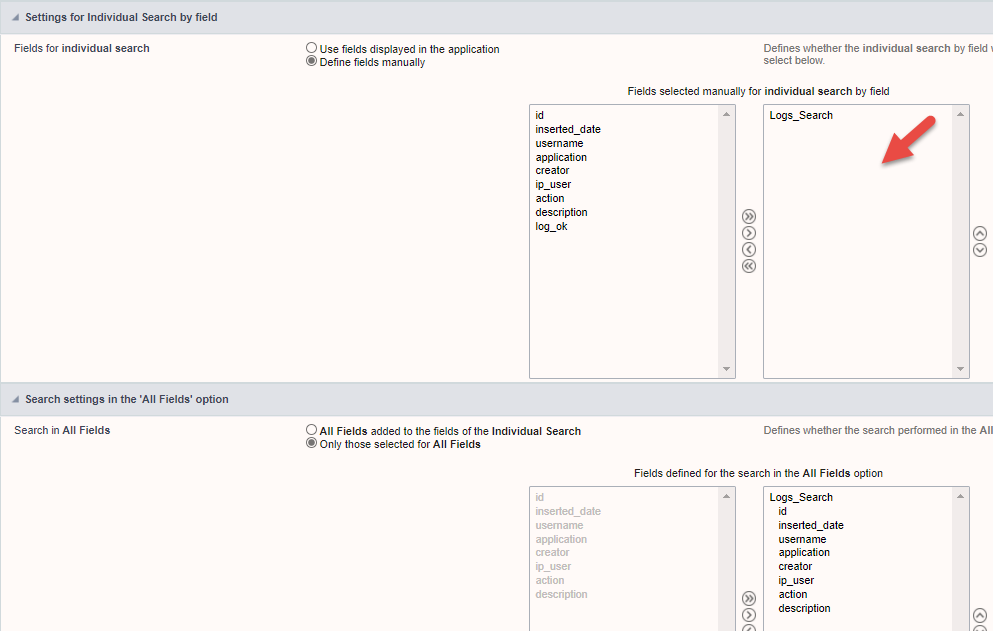
Is the addition of the drop down select in a Quick search mandatory?

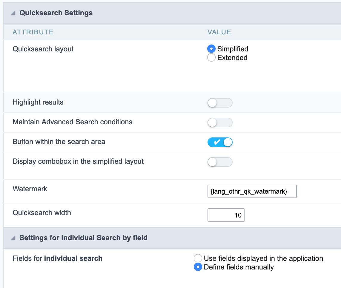
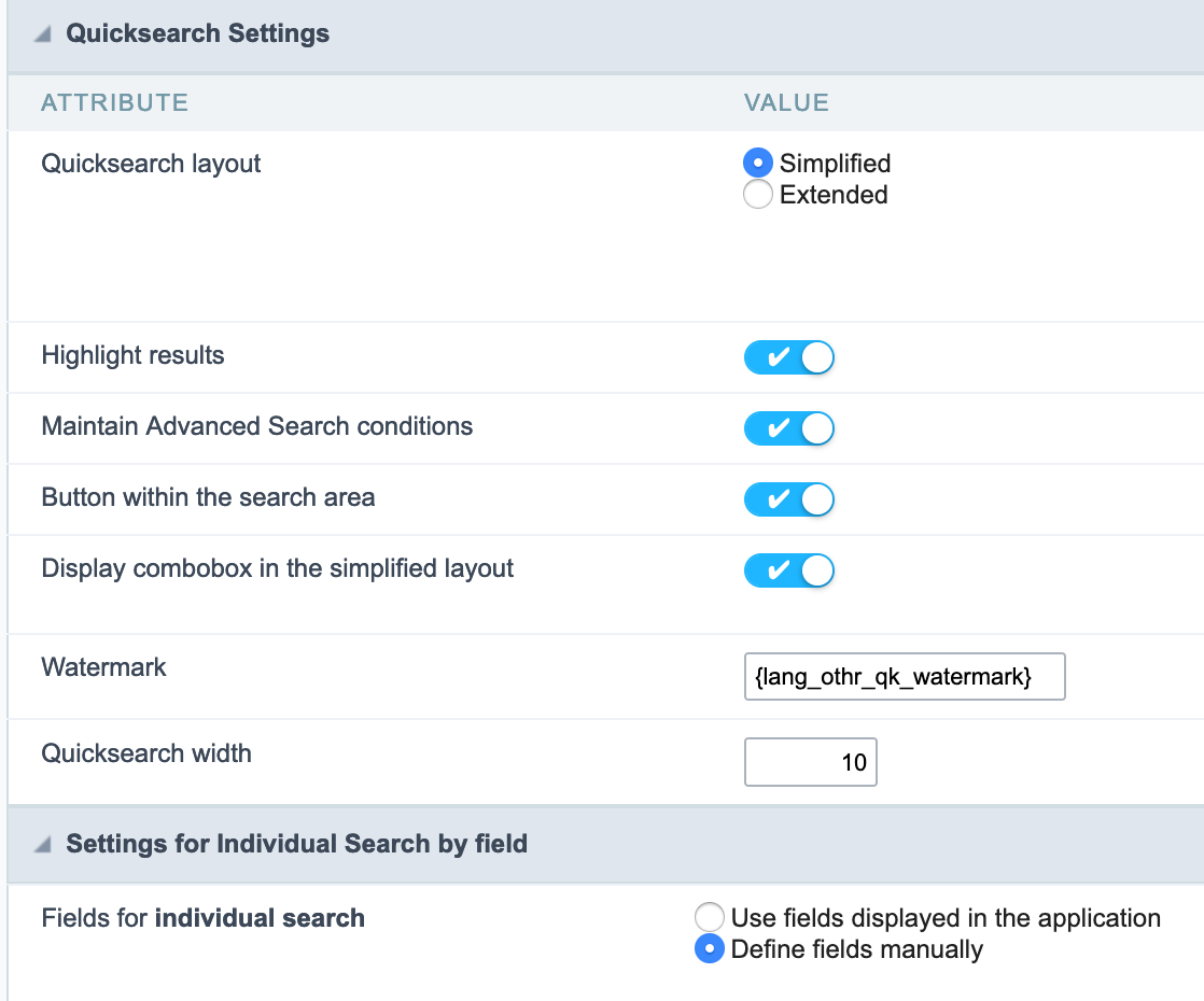
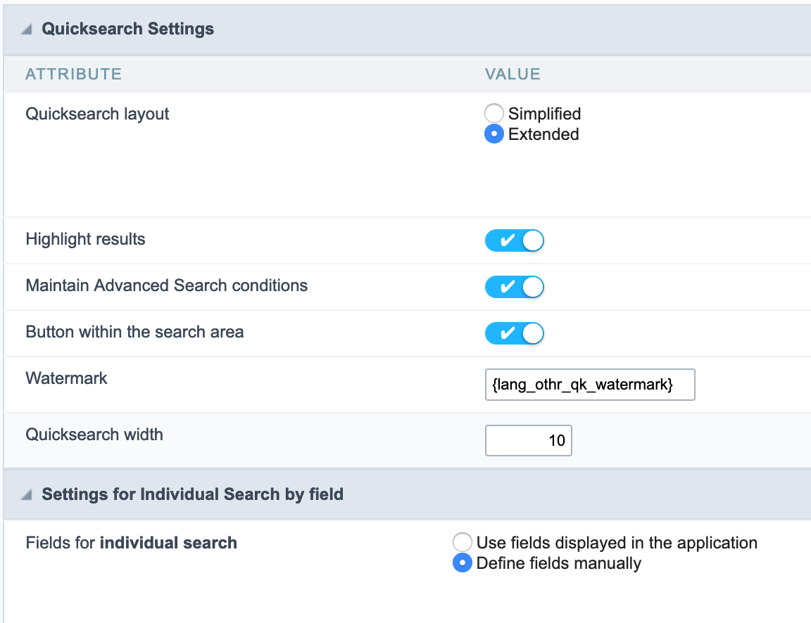
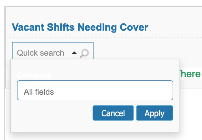
Whenever I create a grid now the Quick search looks like
Screenshot 2021-03-05 at 16.25.32

I much preferred the cleaner look of:
Screenshot 2021-03-05 at 16.26.23

I’ve tried all sorts of combinations of options but always seem to have this messy drop down. To my mind this doesn’t make it feel - or look quick. (and the select doesn’t match the Select2 styling either)

Am I missing something or are we stuck with it?

i’m using 9.6, and in my new applications it has the look of the second cleaner picture.

This is because you selected to display the combobox in the simplified layout

image

1 Like

Ok - maybe it didn’t work… (and I checked and I’m on 9.6)

get me this:
Screenshot 2021-03-10 at 12.42.07

and


gets me
Screenshot 2021-03-10 at 12.43.28

And if I try


I get this
Screenshot 2021-03-10 at 12.48.59 Screenshot 2021-03-10 at 12.48.52

I seem to have lost the ability to get the simple clean version.

Any ideas gratefully received!

If you select more then 1 field in the individual search it will show the All fields drop down

Thanks for that - yes that’s solved it. Odd logic… (it didn’t used to require all this faffing)!

So to get a clean Quicksearch box…

  • Layout should be simplified

  • Display combo box in simplified layout must be off

  • Individual search must be manual and empty of any fields

  • All fields must include all the fields that are wanted as searchable fields

Anything else will bring up the select box as well. Quick for users, not so quick to set up.

1 Like