
Hello,
I am developing a 2D Column Chart in 6 metrics (sum of different products) and 1 dimension (date). In the y-axis, I want to have the label as “Sum of products”, and the legend with the names of the products. However, the default puts all the names on the y-axis, as displayed in the image below:
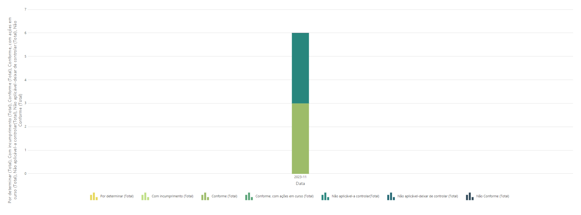
I tried to change in the Settings → Label for the summarization, but nothing happens.
Thank you