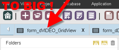
WHAT IS THE REASON TO USE 5-6 different font sizes in SC IDE ? Some fotns are to small and some are to large! There is a basic rule in IDE design. Fonts should not be different by more than 10%. So if one uses 10pts as standard, then the largest font used should not be larger than 11pt and smaller than 9pt (except for the big headers etc.)
I wonder why NetMake does certain changes even consulting users. The font sizes on the tabs which represent each opened App got increased by 20-30%. This way we can see less ! YES - less - so there is more scrolling. Why change something which is working fine ? Seems like the icons were also enlarged so instead fitting about 12 opened Apps, now I can only fit 8. This really isn’t any improvement for me.
here is an example…of text below
[SIZE=7]PLEASE CHANGE IT TO THE WAY IT WAS BEFORE (in SC7), it was fine. ! [/SIZE]
does it really match with the rest ? ugly right ?
I also would like to see the setting which allows to bind the line all Apps tabs which do not fit into first line put into second line (OR have selectable drop down list) to select from the opened Apps). LEFT/RIGHT scrolling, where there is no scrollbar is very inconvenient and super slow !
Arthur

